A well-known food brand presented a challenge: improving the conversion of the registration form for its baby family loyalty program.
The original form displayed all fields on a single page, with no clear visual structure or emotional connection. My goal was to transform that flow into a more human, visual, and segmented experience, one that feels aligned with the emotional universe of the brand and supports families through each step of the process.
Sign up form
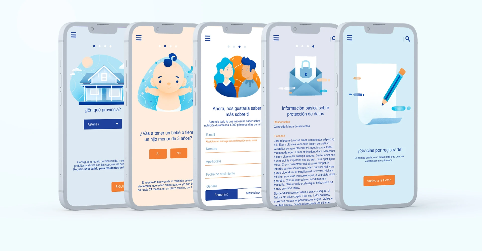
The original registration process was built around a standard one-page form, which made the experience long, flat, and emotionally disconnected. To improve conversion, we proposed a new UX approach: transforming the form into a clear and friendly multi-step flow, with illustrations guiding users through each phase. On mobile, the design was optimized to reduce scrolling and create a smoother, more focused interaction.
All required fields and functionalities were kept, but the entire frontend was redesigned to improve clarity, reduce cognitive load, and reinforce trust. The color palette used the brand’s corporate tones and soft gradients to create a pastel universe aligned with the baby-focused brand.
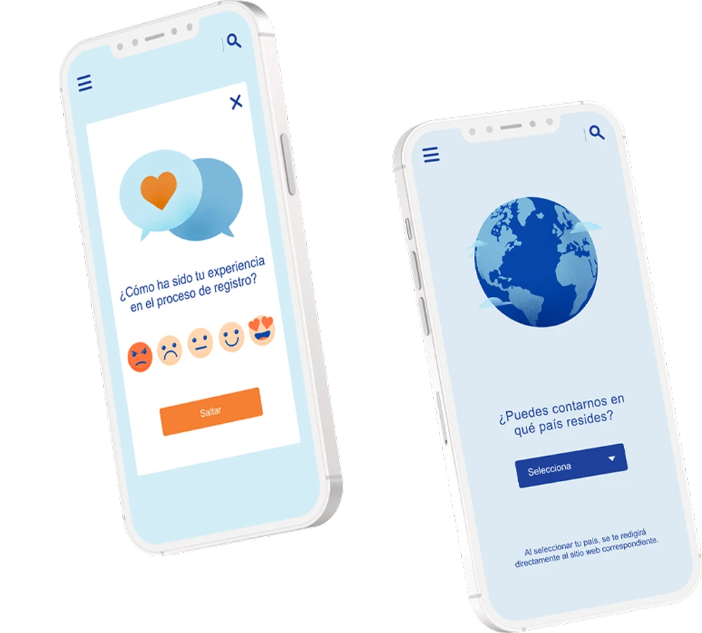
We also designed two additional screens to support the new experience:
A custom feedback screen to replace the generic plugin used in the original one.
A dedicated screen for international users, allowing the platform to collect relevant data from other families interested in the Spanish program.
This improvement confirmed that breaking the flow into smaller steps helped users progress more comfortably and complete the registration more often.
Original form 10,6%
New form 15,9%
The A/B test clearly showed the impact of the redesign. The new multi-step form outperformed the original version, proving to be significantly more effective.
BONUS TRACK
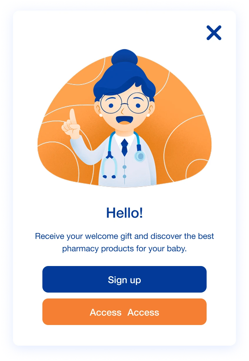
Affinity modal
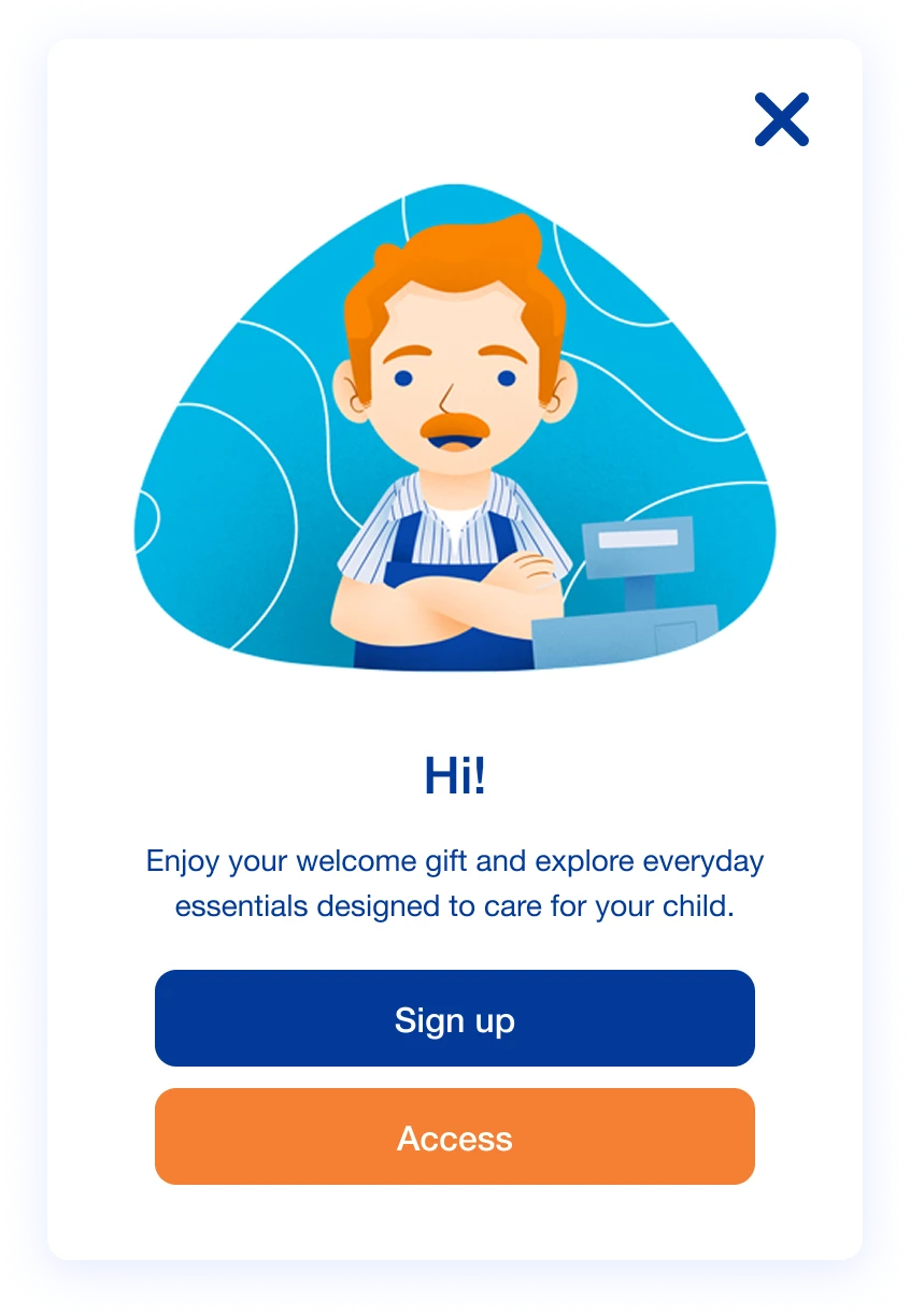
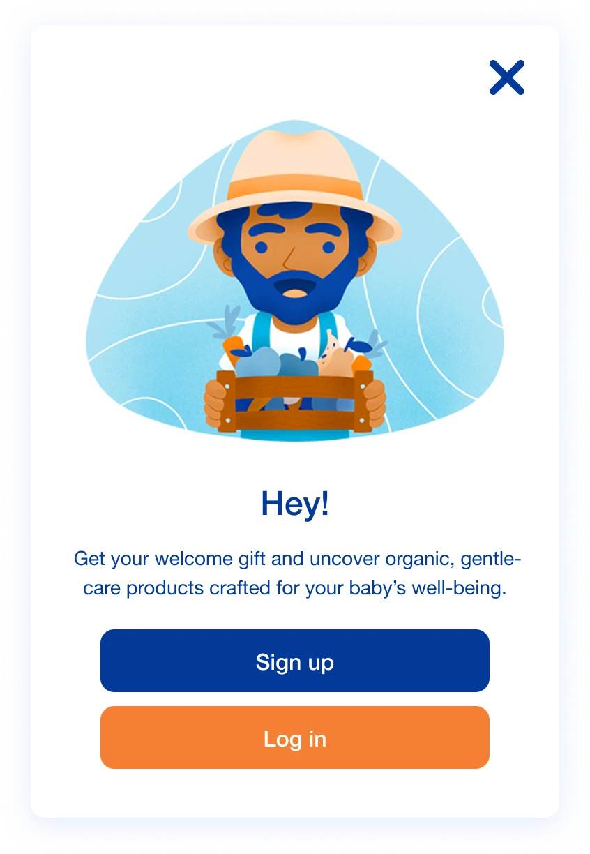
Based on the different audience segments provided, we created specific pop-up modules designed to guide users toward brand pages that matched their interests and encourage product discovery.
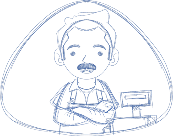
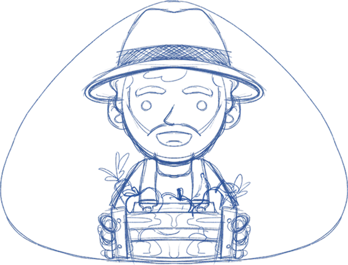
To support this strategy, three tailored illustrations were developed for each audience segment: