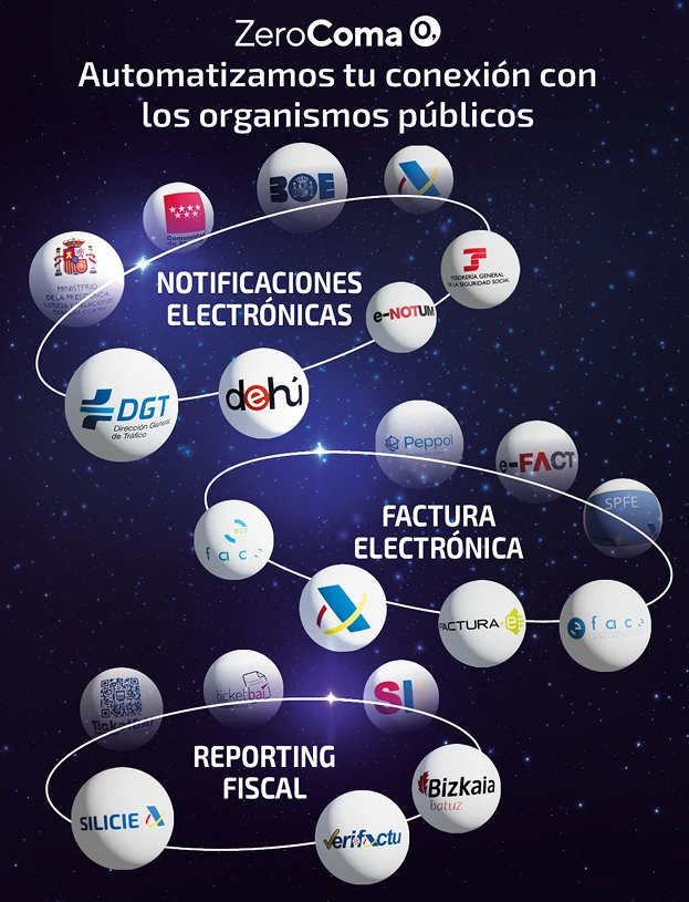
Zerocoma is a company specialized in digital transformation solutions, helping organizations implement processes such as electronic invoicing, certified document digitization, automated accounting, expense management, electronic notifications, and regulatory compliance.
This project began with the visual development of an illustration kit for its mascot, a robot created as a visual metaphor to represent automation, efficiency, and technological support across Zerocoma’s services.
Early concepts
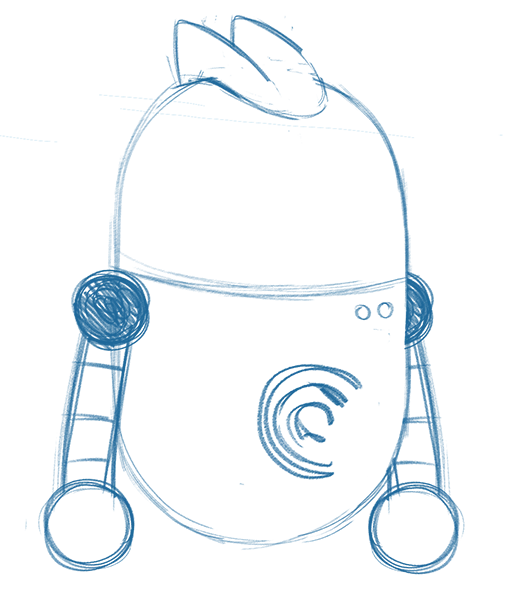
To find the right balance between technology and personality, I explored three different robot concepts through early sketches and visual experiments. Each proposal tested a unique silhouette, mood, and design language, helping define what Z3r0 should feel like before refining the final character.
Here is Z3R0
Final round
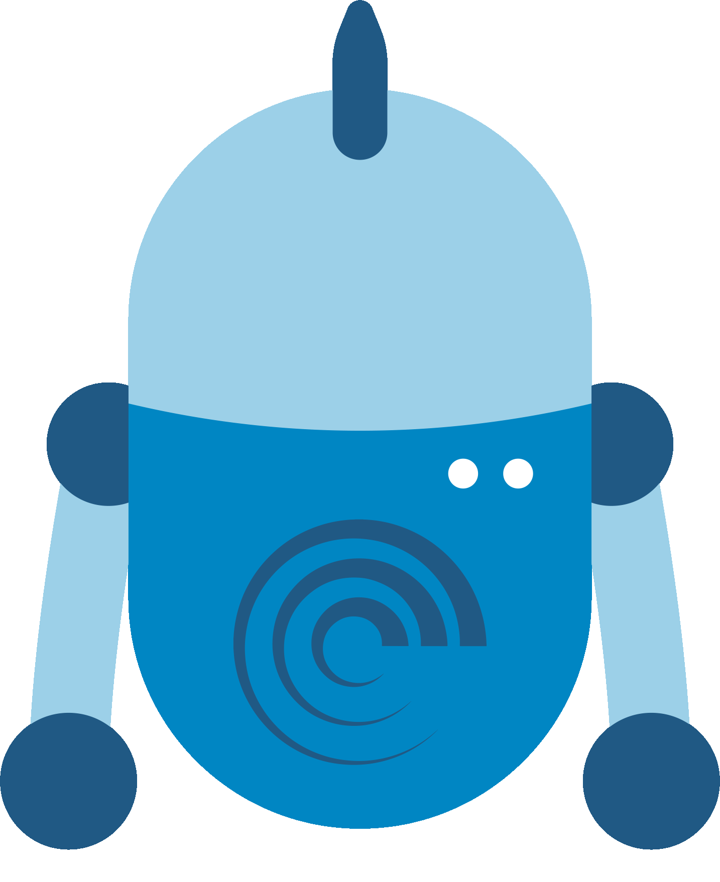
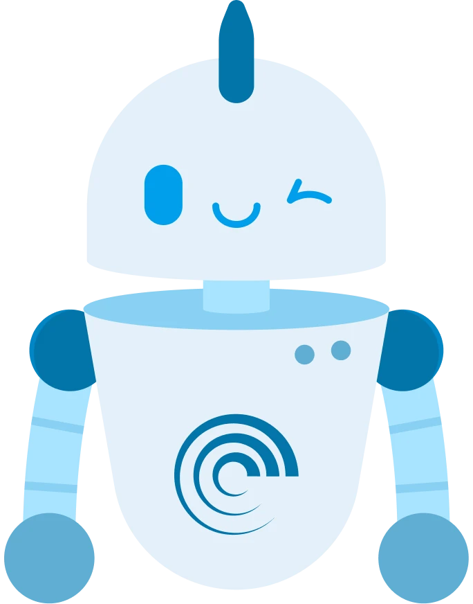
After presenting the three initial robot proposals, the final decision was made by the client. Zerocoma chose a capsule-shaped robot, a more minimal and synthetic approach that felt modern, friendly, and easy to adapt across different formats. The concept also introduced digital facial expressions, allowing Zero to communicate emotions clearly while keeping a clean, tech-driven look.
Head concepts
Color test
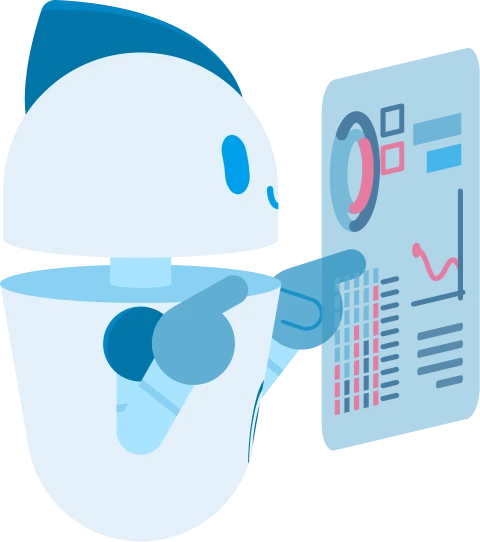
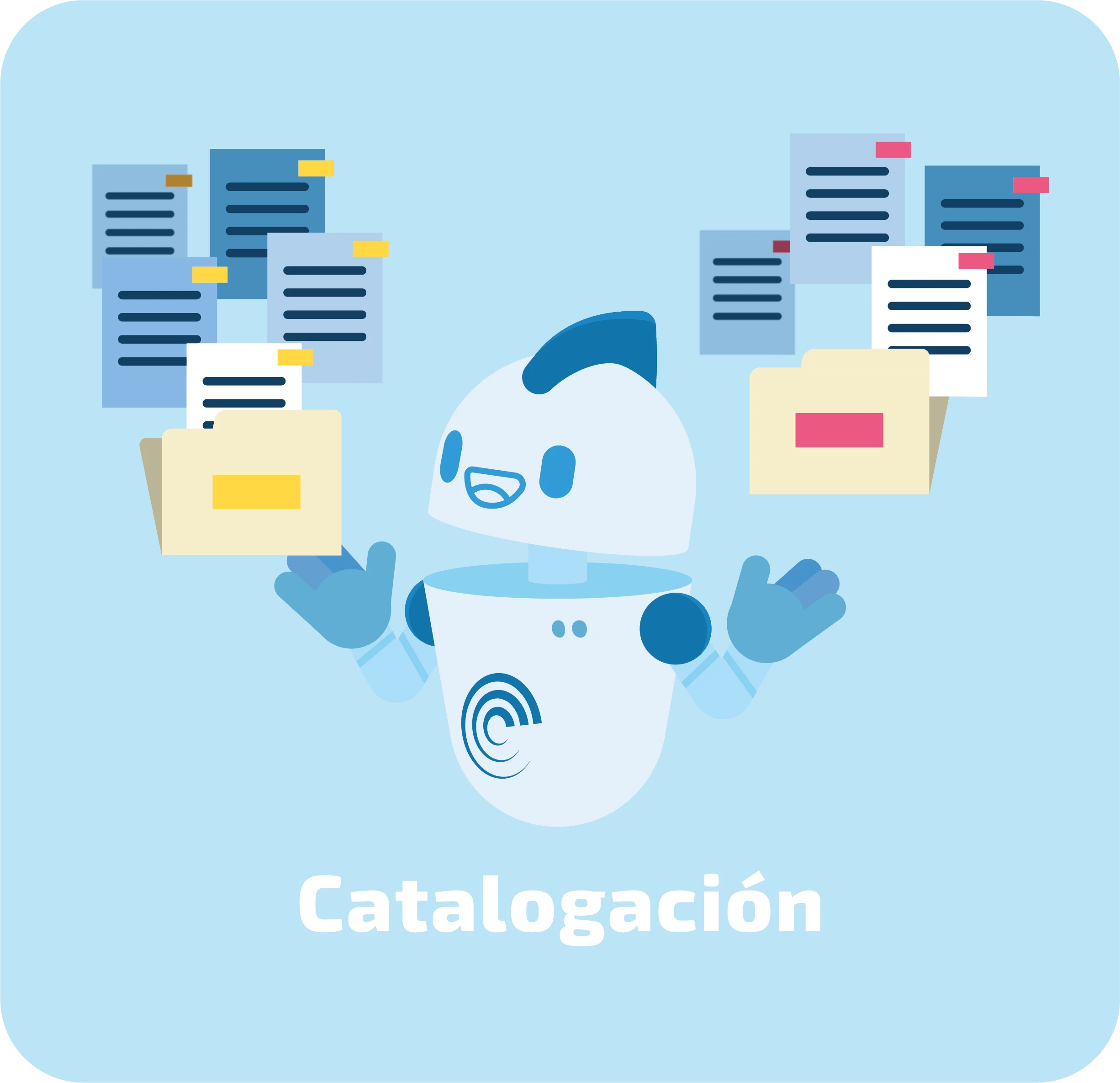
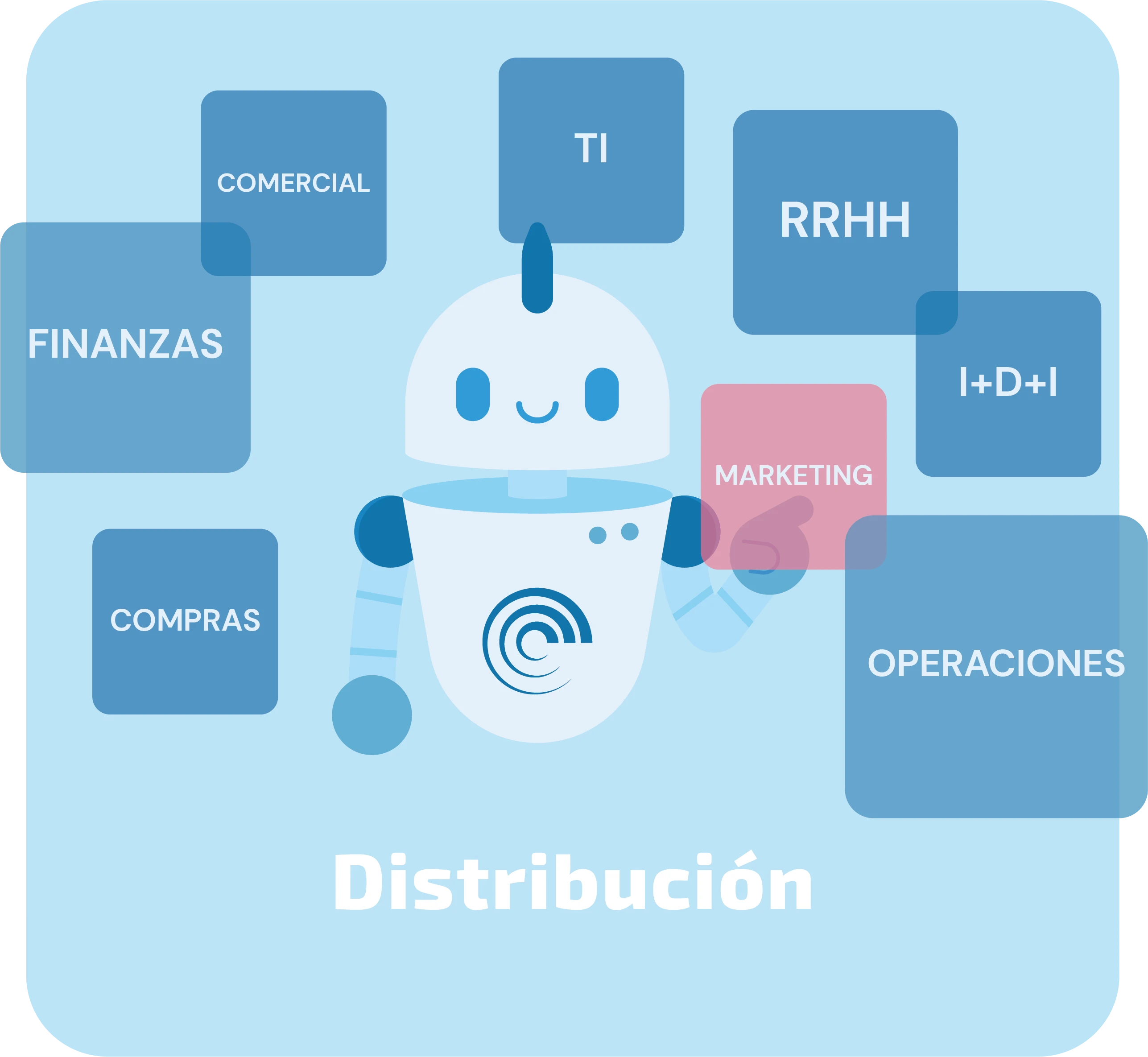
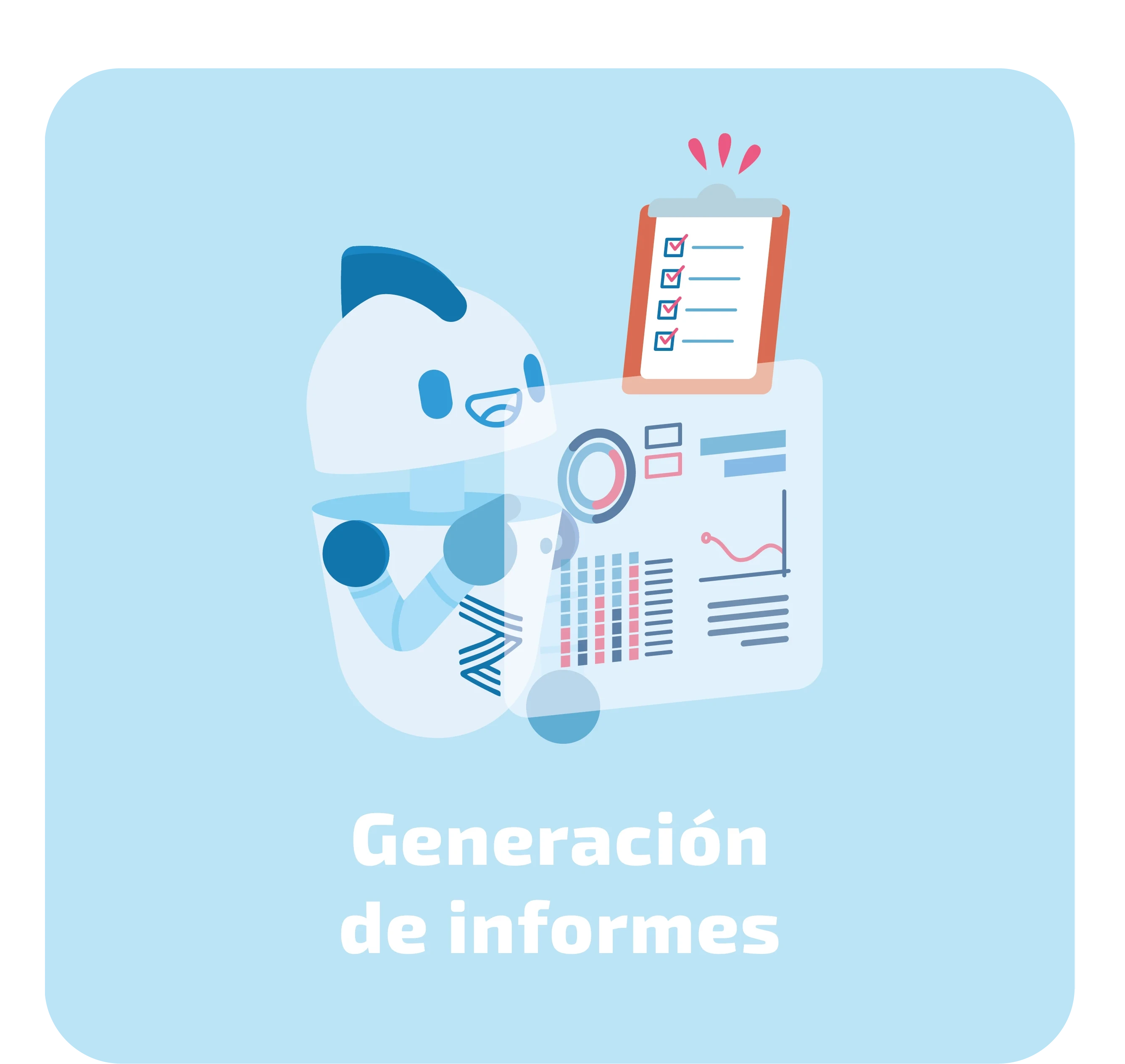
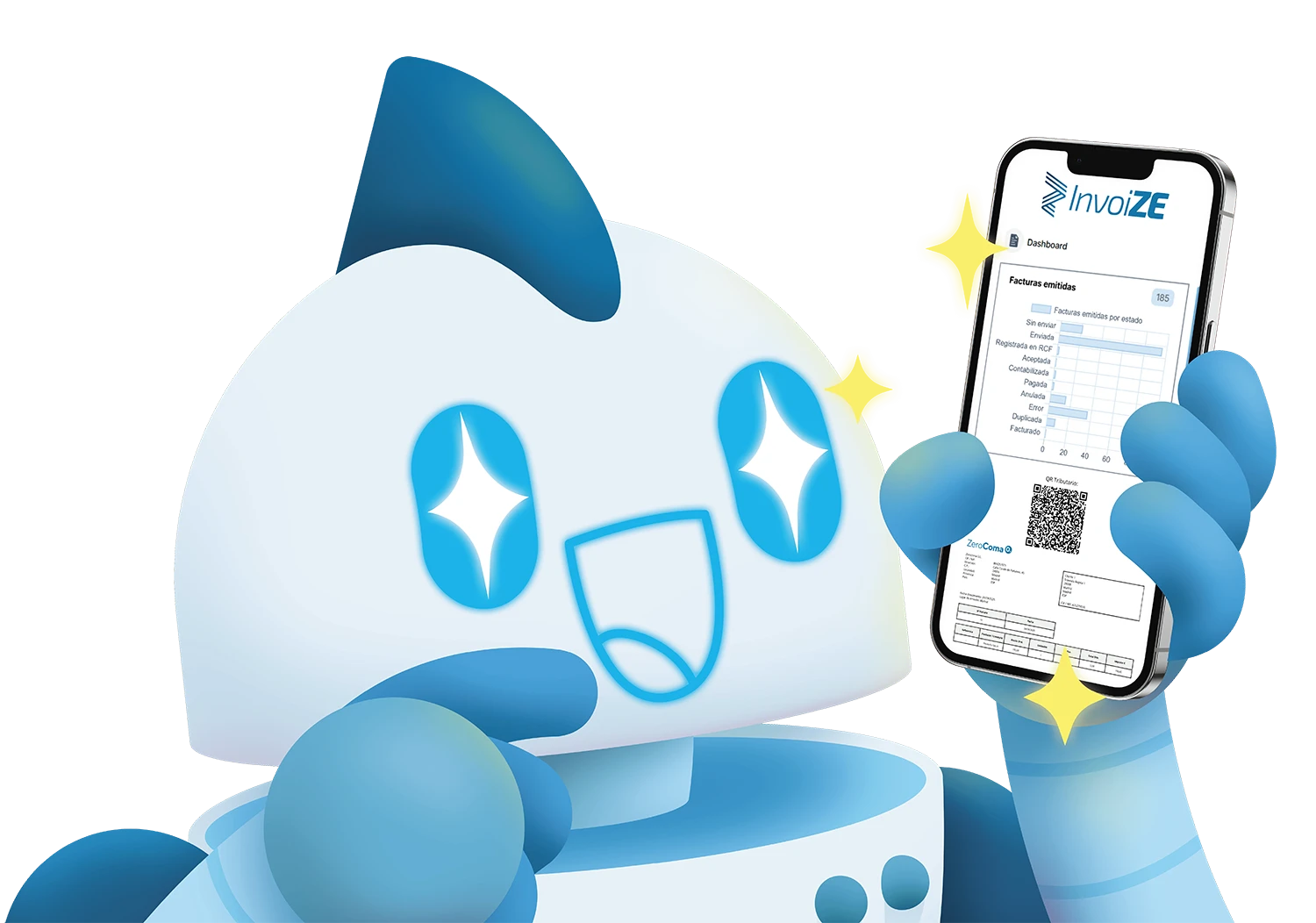
Illustration kit with 6 pose variations, arms, facial expressions and accesories
Some accesories
Z3R0 in motion
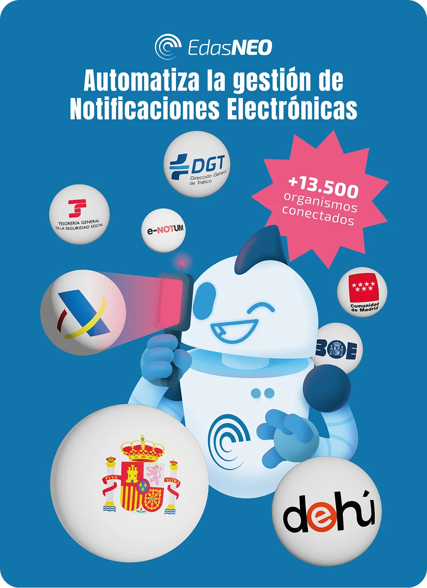
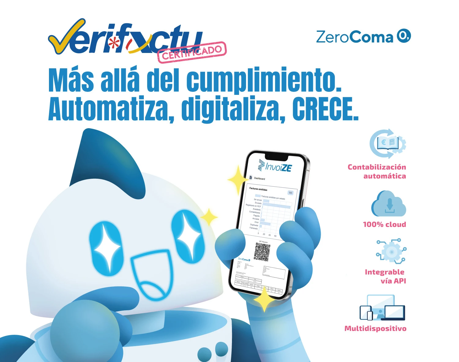
Services animations
After presenting the three initial robot proposals, the final decision was made by the client. Zerocoma chose a capsule-shaped robot, a more minimal and synthetic approach that felt modern, friendly, and easy to adapt across different formats. The concept also introduced digital facial expressions, allowing Zero to communicate emotions clearly while keeping a clean, tech-driven look.
Z3R0 at events
Bringing the stand to life
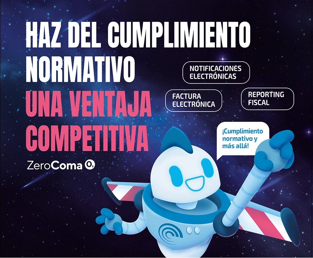
Z3r0’s visual identity was applied to corporate event panels and trade show graphics to give Zerocoma’s booth a more personalized and engaging presence. The mascot helped reinforce the brand message, add character to the space, and create a consistent look across different event formats.
For these large-format visuals, the character was developed in a more polished style, adding volume, shading, and depth to create a stronger impact on-site while keeping the brand look consistent across different event formats.