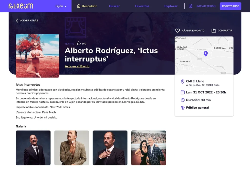
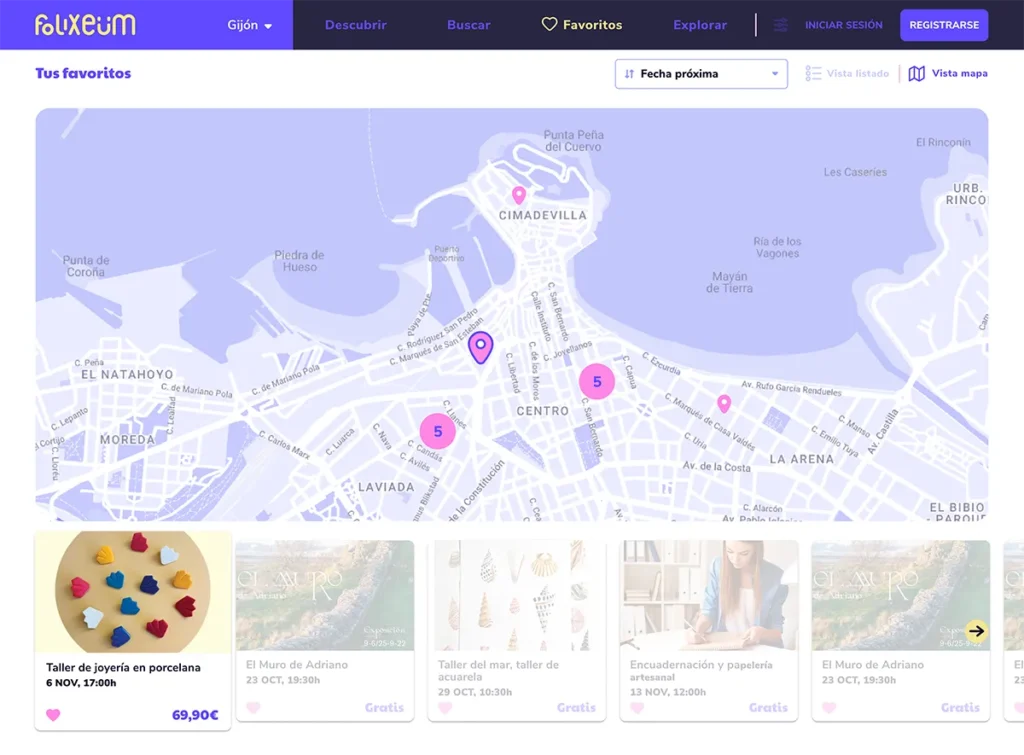
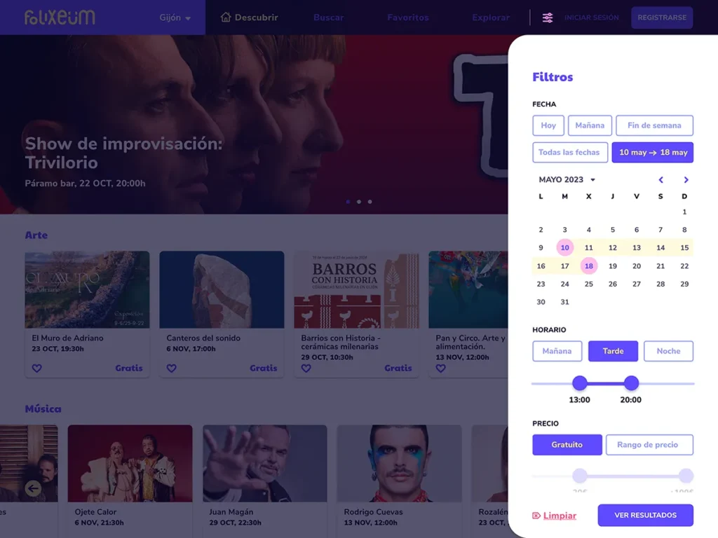
Tradition tells us that the best leisure options are always found in big cities, but that’s not true! In many towns, there is a wide range of options available, but communication is where things fall short. However, one thing is clear: every place has something to offer.
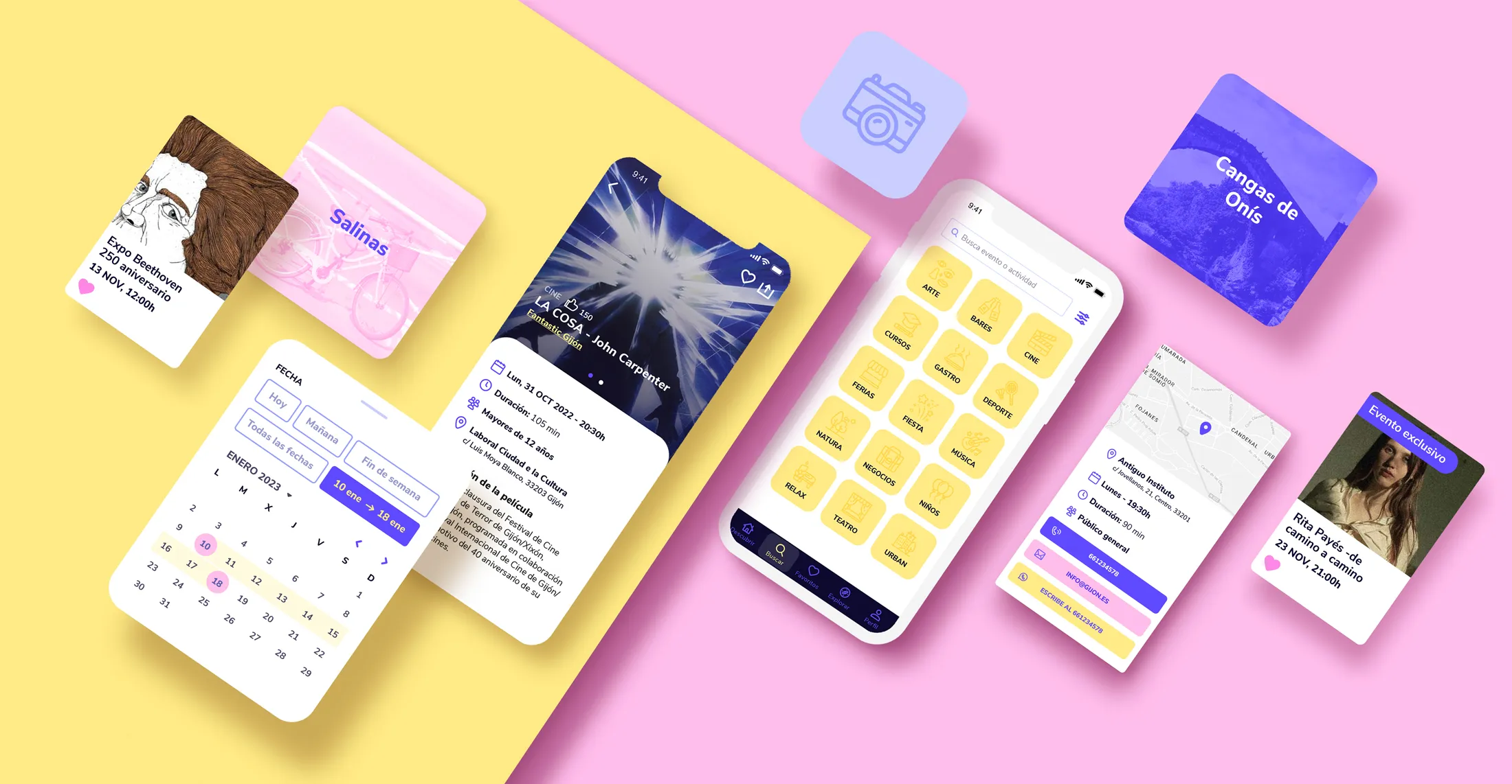
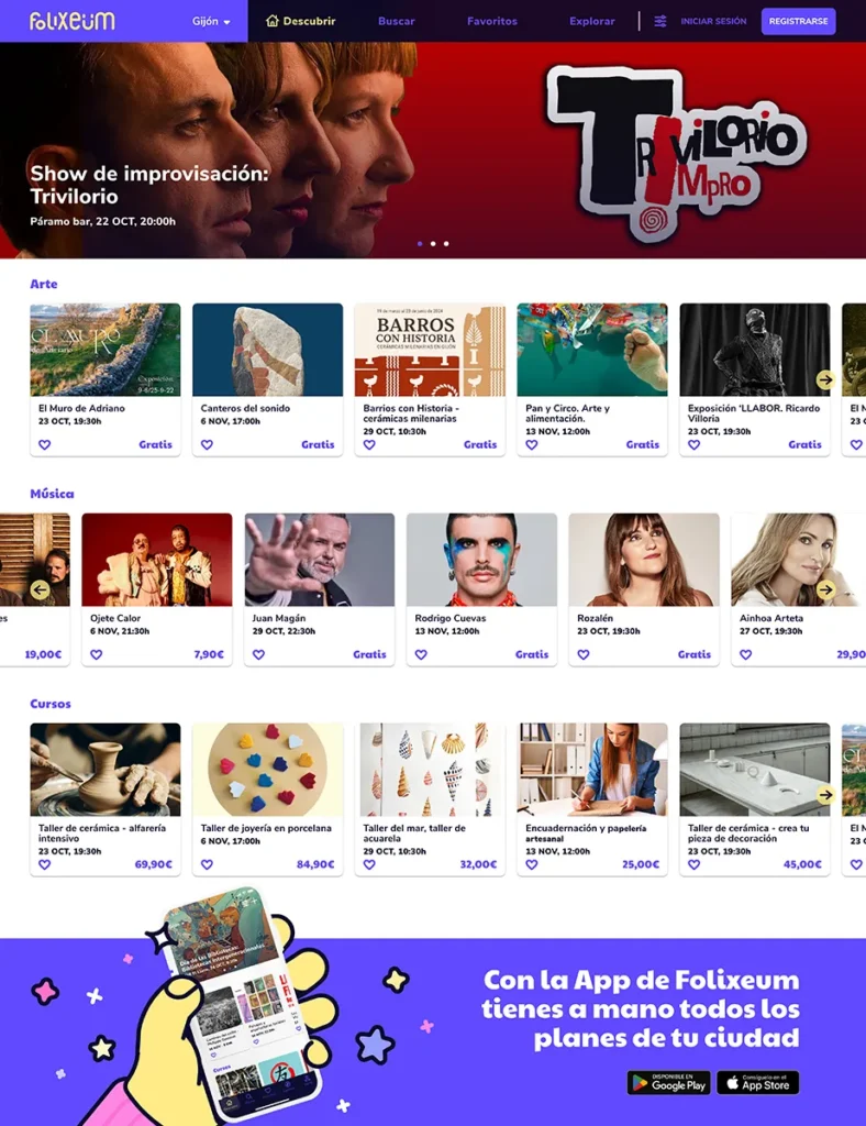
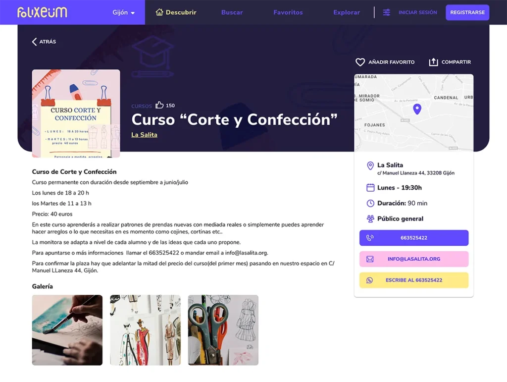
Folixeum is a platform where you can discover all the available plans in the area you are in, regardless of its size.
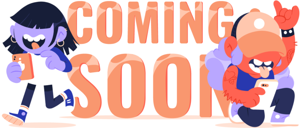
For a first introduction and quick presentation, a script font and autumn-colored palette with a floral touch were chosen to create a ‘coming soon’ landing page for the project. There is also a small illustration with two characters that give a hint of the brand’s spirit.

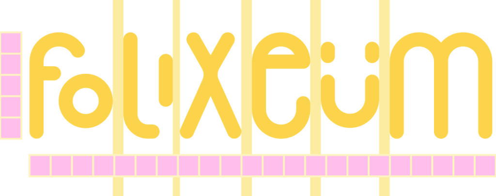
We simplified the shapes using straight lines and rounded bevels, and we took advantage of the curvature of the ‘U’ to create a face, adding a friendly and fun touch. Also, we switched to a more electric and festive color palette, with a dose of nostalgia from the 90s (to connect with our average user and follow trends among younger users).


Isotype
Logo
Main palette
Gradient palette
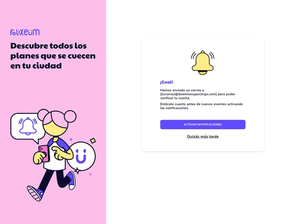
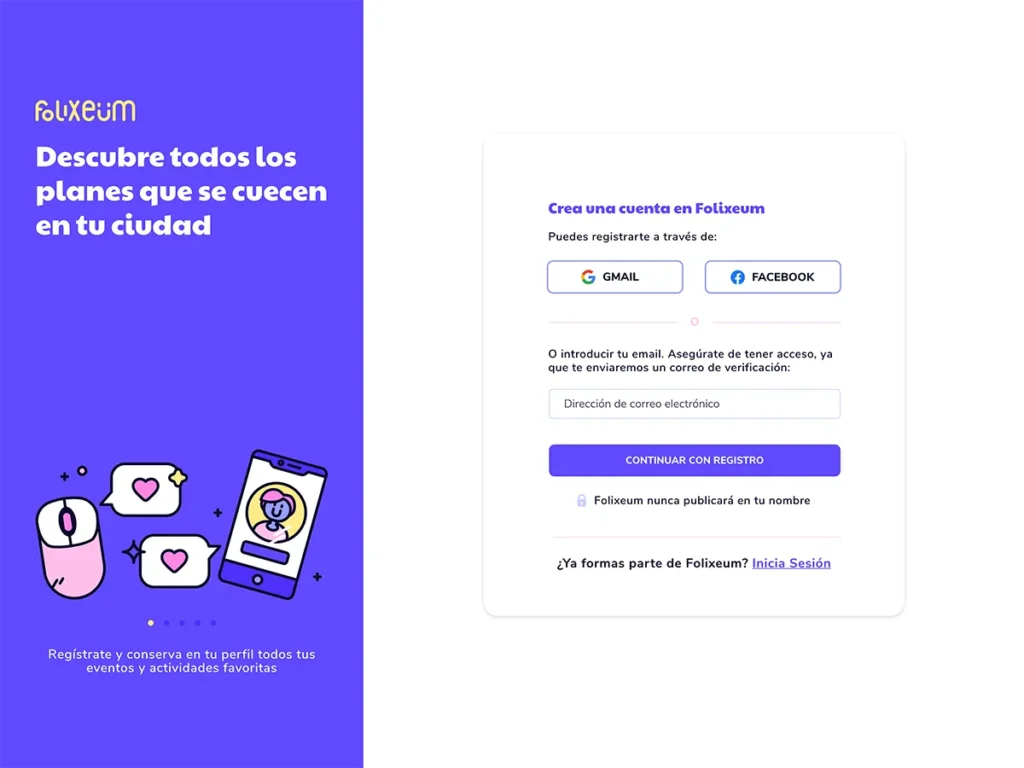
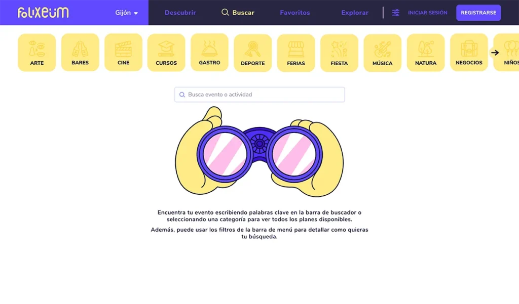
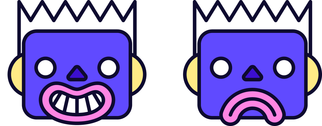
With the goal of using vector illustration, a minimalist and playful style was chosen, using a dark outline that adds a cartoon touch to make it visually engaging. No human expressions—simple, yet effective for creating impact.
Designed for use in onboarding, to support key actions and in informational modals, as well as being an important resource in corporate communication.






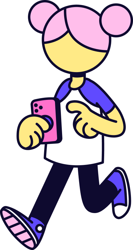
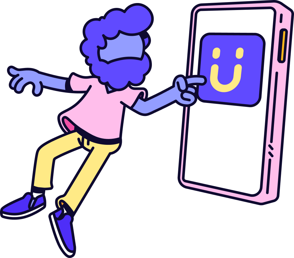

A powerful tool for providing immediate visual feedback is micro-animations, or short, specific animations used on certain illustration elements. They guide the user and add a sophisticated touch to the design, creating smoother, more engaging, and fun experiences.
