
Santa Bárbara, a charming neighborhood in Gijón, has its roots in 1955 when the Moreda Factory built it with the intention of providing homes for its workers’ families. Inspired by the English model, the neighborhood forms a mini city with identical houses, envisioning a home with gardens for everyone.
Despite the lack of attention due to the distance from urbanized areas, the residents decided to take matters into their own hands. They built a community center, transforming the neighborhood into a tightly-knit community, now evolved into a Neighborhood Association that works on an annual program full of activities for the enjoyment of both adults and children.
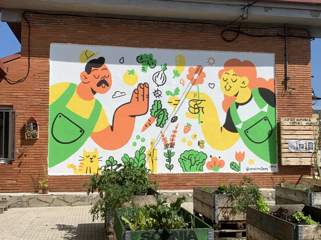
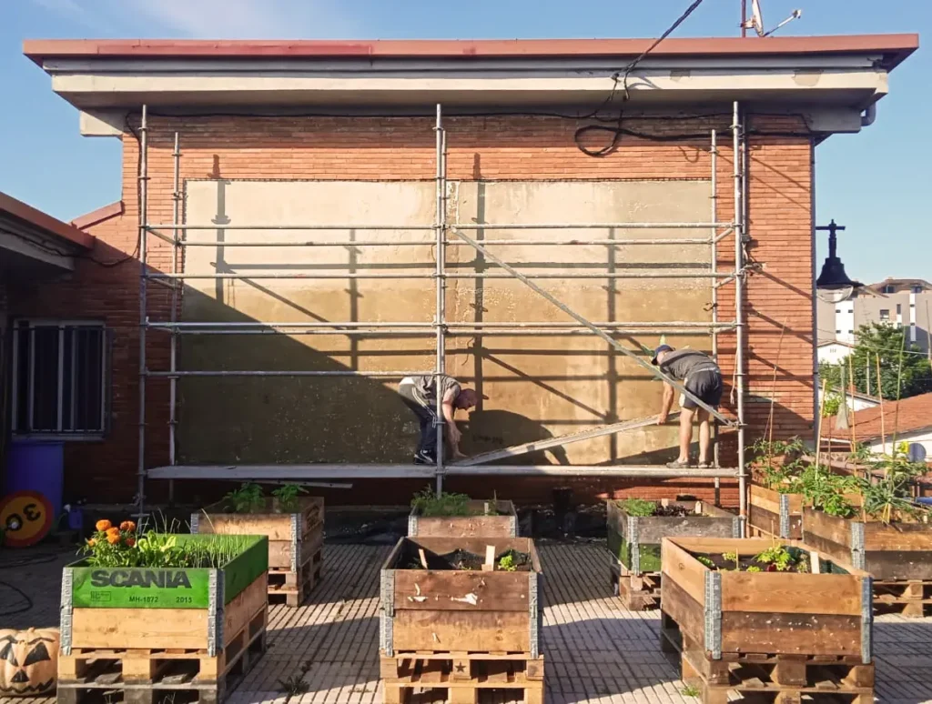
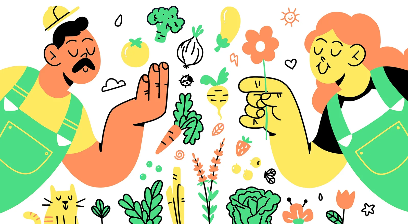
One of them, the creation of a small community garden in one of the spaces of the community center stands out. This required a small renovation, seizing the opportunity to create an illustrated mural that reflects the creative spirit and unity that defines Santa Bárbara today.

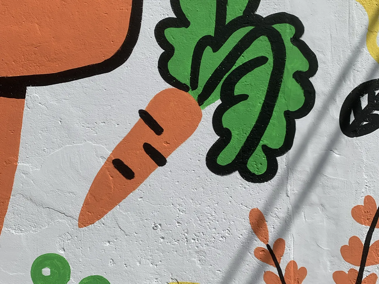
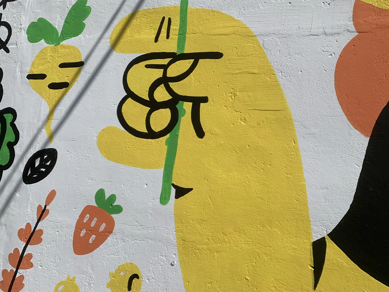
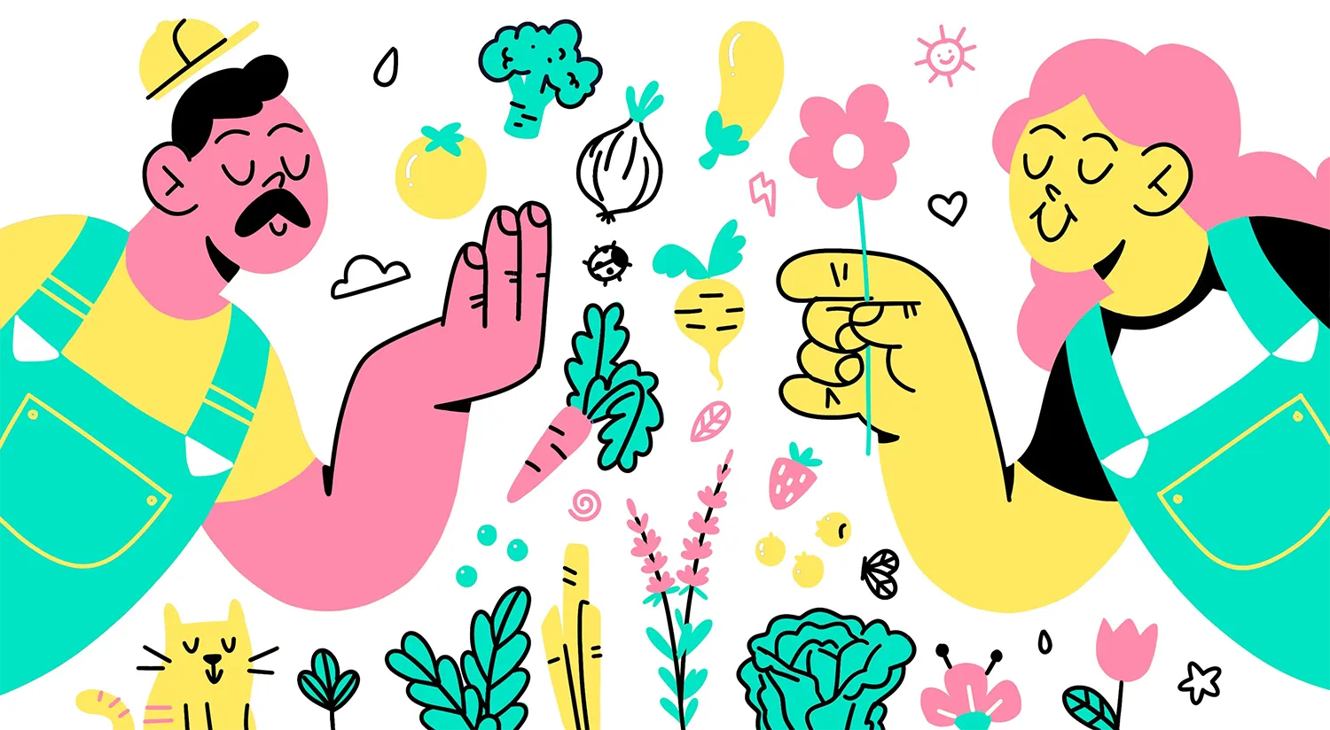
There were various color proposals, all limited to four inks, in order to reduce the budget on materials and also the execution time of the artwork, using strokes to create volumes and a composition rich in elements.
The Association ultimately opted for a version closer to the natural range of its garden, choosing a much more summery ensemble.



Projection is the way to solve the overlay quickly and cleanly. By projecting the image, we mark the contour lines of the drawing and other lines that may be helpful for the final composition.
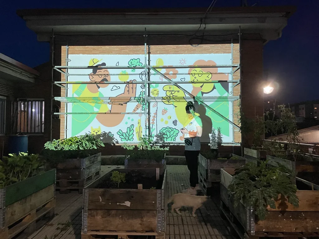
Taking advantage of a few rain-free days in northern Spain, we brought the mural to life in different stages, utilizing the white background and saving the black color for the final touch that completed the image. It’s worth noting that this was the first opportunity that arose for urban art, from which we drew very positive impressions (and a desire to repeat the experience).
As an important detail, the Association asked us to involve the younger neighbors in part of the mural. Thus, the lower area was outlined in pencil and completed one morning when art served as the perfect excuse for a small summer and creativity celebration, bringing everyone together.
In this way, we achieved a piece with simple forms, transformed into an expression where everyone could leave their mark.

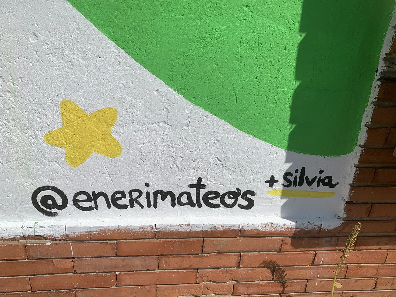
Days later, we moved to finish areas and details, ultimately completing the mural that we hope will coexist with this community for many years.
